Modal
Try it
The modal component is a core Dyvix UI component. It's a config driven, animated modal engine that supports multiple themes, animations, and validation presets out of the box.
Attributes
title- :
string. Represents the header of the modal.
- :
Id- :
string. A Unique ID for your modal, allowing more control for the developer.
- :
className- :
string. Contains a custom class for your modal, allowing more control for the developer.
- :
type- :
string. Represents the type of the modal. Defaults toform. Supported types areformandauth.
- :
theme- :
string. Controls the design and the feel of the modal. See the Themes list for a full list.
- :
background- :
string. Controls the modal background color.
- :
animation- :
string. Controls the entrance animation of the modal. See the Animation List for a full list.
- :
preset- :
string. A convenience attribute that populates the modal with predefined configuration. Using presets overrides elements attribute with modal common-uses. See the Preset list for a full list.
- :
elements- : An array of objects that defines the internal fields of the modal. Each object supports the following attributes:
amount- :
number. The number of inputs to display per row. Supported values are between 1 and 3.
- :
type- :
string. The type of input to render in this specific row. See the elements list for a full list.
- :
name- :
string | string[]. The key used in theonSubmitcallback. If the amount is greater than 1 this must be provided as an array of strings with length matching that of the amount.
- :
placeholder- :
string | string[]. The text displayed when the input is empty. If the amount is greater than 1 this must be provided as an array of strings with length matching that of the amount.
- :
id- :
string | string[]. A Unique optional ID for indivisual fields, allowing more control for the developer. If the amount is greater than 1 this must be provided as an array of strings with length matching that of the amount.
- :
options:
Array of Array[values]. Required when type isselect,d-select, orautocomplete. It provides selection data for the supported elements, the amount of sub-arrays must match the amount property. For example:jsx{ type: "select", amount: 3, placeholder: ["Select Size", "Choose Color", "Shipping Method"], name: ["Size", "Color", "Method"], options: [ ["Small", "Medium", "Large"], ["Red", "Blue", "Green"], ["Standard", "Express", "Prime"] ] }
validation:
string | string[]. Defines the validation logic of the field. If the amount is greater than 1 this must be provided as an array of strings with length matching that of the amount. Support built-in preset found in validators list or custom patterns by using pattern-embeding prefix$R. Moreover, you can embed a custom error message using the | separator. For example:jsx{ amount: 3, validation: ["email", "$R^\\d+$|Numbers only", DYVIX_MODAL_VALIDATION_PRESET.PASSWORD], }
match:
string | string[]. Links two modal fields where the current field will only pass validation if its value matches the value of the referenced field'sid. For example:jsx{ "type": "password", "placeholder": "Confirm Password", "id": "confirm-password", "name": "confirmPassword", "match": "new-password", // The id of the target field "amount": 1 }
- : An array of objects that defines the internal fields of the modal. Each object supports the following attributes:
onSubmit- :
function. A callback function triggered upon form submission. It receives a singledataobject containing all input names along with their value.
- :
onChange- :
function. A callback function triggered every time an input value changes. It receives a singledataobject containing all input names along with their value.
- :
onClose- :
function. A callback function triggered upon form closure. Available only when the modaltypeis set toform.
- :
Understanding Dyvix Constants
Dyvix constants are a built-in configuration engine designed to eliminate "magic strings" and provide a type-safe environment for dyvix users. By using these exported constants you benefit from IDE autocompletion preventing common typos that could break your UI. The modal component currently supports 5 constants groups:
DYVIX_GLOBAL_THEME- : Used in the theme attribute e.g.
theme={DYVIX_GLOBAL_THEME.NEON}.
- : Used in the theme attribute e.g.
DYVIX_GLOBAL_ANIMATION- : Used in the animation attribute e.g.
animation={DYVIX_GLOBAL_ANIMATION.AURORA}.
- : Used in the animation attribute e.g.
DYVIX_MODAL_TYPE- : Used in the modal type e.g.
type={DYVIX_MODAL_TYPE.AUTH}
- : Used in the modal type e.g.
DYVIX_MODAL_VALIDATION_PRESET- : Used in the modal elements validation e.g.
validation: [DYVIX_MODAL_VALIDATION_PRESET.EMAIL]
- : Used in the modal elements validation e.g.
DYVIX_MODAL_ELEMENT- : Used in the modal elements type e.g.
type: DYVIX_MODAL_ELEMENT.TEXT
- : Used in the modal elements type e.g.
Example
Without Dyvix Constants
import { Modal } from 'dyvix-ui';
function ModalExample() {
return (
<Modal
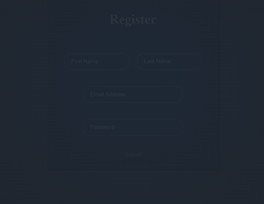
title="Register"
Id="register-modal"
className="modal"
theme="Aurora"
animation="glitch"
type="form"
elements={[
{
type: 'text',
placeholder: ['First Name', 'Last Name'],
id: 'name',
name: ['firstName', 'lastName'],
className: 'ex-text',
amount: 2
},
{
type: 'email',
placeholder: 'Email',
validation: 'email',
id: 'email',
name: 'email',
className: 'ex-text',
amount: 1
},
{
type: 'password',
placeholder: 'Password',
validation: 'password',
id: 'password',
name: 'password',
className: 'ex-text',
amount: 1
}
]}
onSubmit={(data) => console.log(data)}
onChange={(data) => console.log(data)}
/>
);
}Using Dyvix Constants
import {
Modal,
DYVIX_GLOBAL_THEME,
DYVIX_MODAL_VALIDATION_PRESET,
DYVIX_GLOBAL_ANIMATION,
DYVIX_MODAL_ELEMENT,
DYVIX_MODAL_TYPE
} from 'dyvix-ui';
function ModalExample() {
return (
<Modal
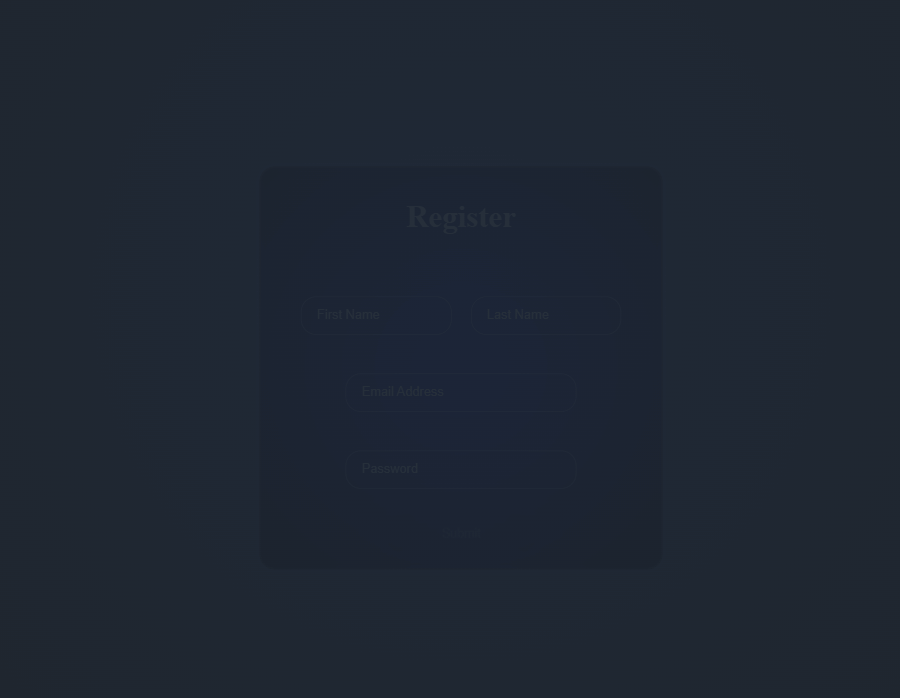
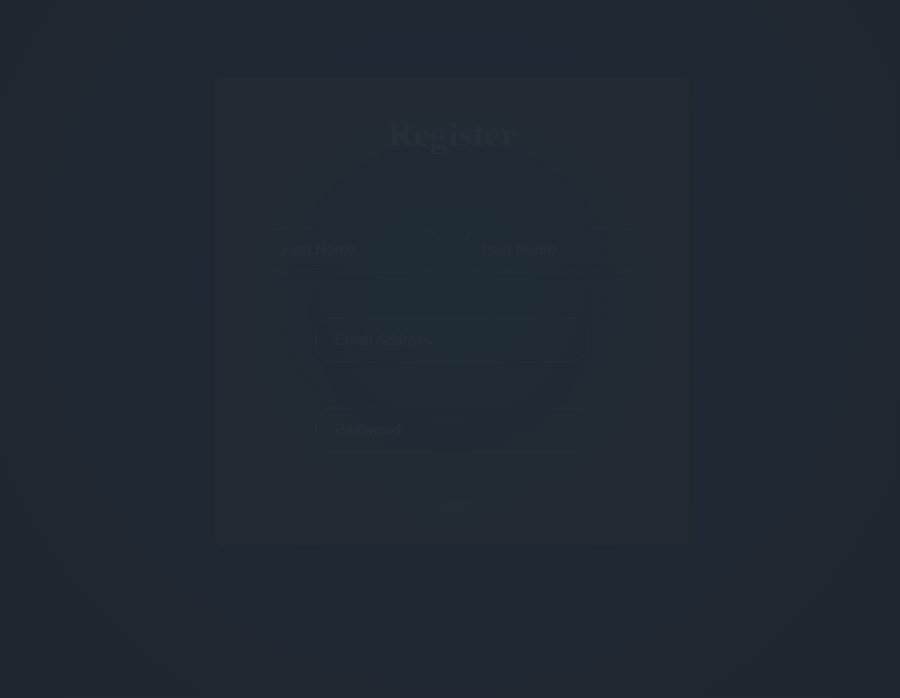
title="Register"
Id="register-modal"
className="modal"
theme={DYVIX_GLOBAL_THEME.AURORA}
animation={DYVIX_GLOBAL_ANIMATION.GLITCH}
type={DYVIX_MODAL_TYPE.AUTH}
elements={[
{
type: DYVIX_MODAL_ELEMENT.TEXT,
placeholder: ['First Name', 'Last Name'],
id: 'name',
name: ['firstName', 'lastName'],
className: 'ex-text',
amount: 2
},
{
type: DYVIX_MODAL_ELEMENT.EMAIL,
placeholder: 'Email',
validation: [DYVIX_MODAL_VALIDATION_PRESET.EMAIL],
id: 'email',
name: 'email',
className: 'ex-text',
amount: 1
},
{
type: DYVIX_MODAL_ELEMENT.PASSWORD,
placeholder: 'Password',
validation: [DYVIX_MODAL_VALIDATION_PRESET.PASSWORD],
id: 'password',
name: 'password',
className: 'ex-text',
amount: 1
},
{
type: DYVIX_MODAL_ELEMENT.CHECKBOX,
name: 'newsletter',
placeholder: 'Subscribe to dyvix UI newsletter!',
amount: 1
}
]}
onSubmit={(data) => console.log(data)}
onChange={(data) => console.log(data)}
/>
);
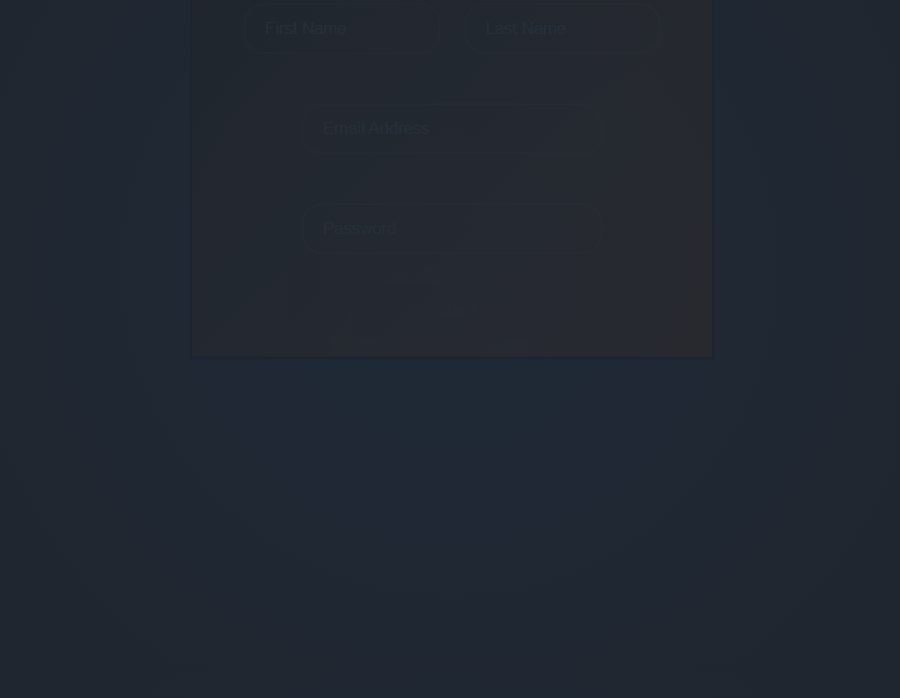
}Available Themes 🎨
| Singularity | Ember | Neon |
|---|---|---|
 |  |  |
DYVIX_GLOBAL_THEME.SINGULARITY | DYVIX_GLOBAL_THEME.EMBER | DYVIX_GLOBAL_THEME.NEON |
| Aurora | Frost | Blade |
|---|---|---|
 |  |  |
DYVIX_GLOBAL_THEME.AURORA | DYVIX_GLOBAL_THEME.FROST | DYVIX_GLOBAL_THEME.BLADE |
| Industrial | Midnight | Ocean |
|---|---|---|
 |  |  |
DYVIX_GLOBAL_THEME.INDUSTRIAL | DYVIX_GLOBAL_THEME.MIDNIGHT | DYVIX_GLOBAL_THEME.OCEAN |
| Forest | Sunset |
|---|---|
 |  |
DYVIX_GLOBAL_THEME.FOREST | DYVIX_GLOBAL_THEME.SUNSET |